CSS Compression and Techniques

Learning to write clean, optimized CSS requires lots of practice and an unstoppable compulsive desire for neatness. Keeping your CSS trim and tidy isn’t all about feeding your crazy psychological need for cleanliness though, in the case of particularly large websites, the payoff is faster loading pages. Faster loading times equals increased usability and higher user satisfaction.

This post will examine several techniques you can use to optimize your CSS as well as several online tools that can automatically compress your code.


To Compress or Not to Compress

Before we get into how to compress your CSS, it should be noted that there is often a tradeoff between compressed and easy-to-read code. Many coders take pride in the organization evident in their CSS and wouldn’t dream of putting it through compressors that strip away comments and line breaks. As a web designer, you should analyze your goals for the code that you write. If you’re creating a small website that only requires a few lines of CSS, there may be no need for extra compression. Also, if you’re writing code that you have to share with a team of programmers, inserting extra comments and line breaks can save your colleagues a lot of time and garner some serious gratitude. However, if you’re designing a large website that requires tons of CSS, you definitely want to keep an eye on your file size and do what you can to keep it down.

It might take a while to find the perfect mix between compression and readability but both are worth pursuing and achieving that balance can make your job a lot easier. Also, it’s definitely not the case that compression always results in a reduction of readability. Many techniques you can use to compress your code will result in better, more organized code.

With that in mind, let’s jump into some techniques for keeping your CSS file size to a minimum.

Empty Style Blocks

Let’s start with the obvious. If you’ve got a style block with nothing in it, toss it. Don’t whine about how you might use them later either, they’re just clutter and you know it. Don’t add it unless you’ve got a reason to.

Shorthand

CSS Shorthand is a method of combining multiple lines of CSS into a single command. Making a habit of using all the shorthand tricks you are aware of can drastically reduce the lines of code you write in the long run. Here’s an example:

Long Version:

#container {
     padding-top: 5px
     padding-right: 10px
     padding-bottom: 30px
     padding-left: 18px
}


Shorthand version:

#container {
     padding: 5px 10px 30px 18px;
}


For more CSS shorthand tricks, visit the article below.


CSS Sprites

The basic idea behind CSS sprites is reducing the number of HTTP requests to speed page load times. How sprites accomplish this feat is by combining multiple images into a single image, commonly in a grid format. Each individual image is displayed by shifting the background-position of the larger image. For a more detailed look at CSS Sprites, check out Chris Coyier’s tutorial over at CSS-Tricks:


Comment Reduction

I love to fill my code with comments. The more comments I put it, the faster I can visually sort through the different sections of code. However, if you’re going for highly optimized CSS with a small footprint, excessive comments can eat up precious KBs. Try eliminating any unnecessary comments and reformatting those you absolutely must keep to as few characters as possible.

Reasonable Font-Families

When file size is a big issue, don’t pack your font-famlies to the max with alternatives. Cut out all the unnecessary fat and trim your extra options down to one or two.

Before:

#container {font-family: Palatino, Georgia, Times, serif;}


After:

#container {font-family: Palatino, serif;}


Use Hex Colors

To cut down on characters, convert any RGB values to their hexadecimal equivalents. This may seem trivial, but every character counts!

Before:

#container {color: rgb(131, 100, 219);}


After:

#container {color: #8364DB;}


Eliminate Line Breaks

Go through each style block and remove unnecessary hard returns. You can also ditch the last semicolon

Before:

#container {
     margin: 5px;
     padding: 5px 10px 30px 18px;
}


After:

#container {margin: 5px; padding: 5px 10px 30px 18px}


10 Online CSS Compressors

CSS compressors automate much of the work of cleaning up your code. Many of them give you the percentage by which your file size has been reduced so be sure to try a few to see which one is best.

CSS Drive


Options:

Compression Mode: Light, Normal or Super Compact

Comment Stripping: None, all, or those longer than a specified length


CSS Compressor


Options (Choose Yes or No for Each):

Sort Properties

Compress Colors

Compress Font-weight

Lowercase Selectors

Remove Unnecessary Backlashes

Remove Unnecessary semi-colons


Arantius


Options (Choose Yes or No for Each):

Strip Comments

Strip Comments at Least x Characters Long

One Rule Per Line

CSS Optimizer


Options:

Do Not Remove Line Breaks (Yes or No)

Get CSS from URL, File, or Pasted Text


Lottery Post


Options: None

Clean CSS


Options (Choose Yes or No for Each):

Sort Selectors

Sort Properties

Optimize Selectors and Their Properties (0, 1 or 2)

Merge Shorthand Properties

Only Safe Optimisations

Compress Colors

Compress Font-weight

Lowercase selectors

Case for Properties (Lowercase of UpperCase)

Remove Unnecessary Backslashes

Convert !important-hack

Remove Last ;

Save Comments

Discard Invalid Properties (CSS2.1, CSS2.0 or CSS1.0)

Output As File


Pingates


Options (Choose Yes or No for Each):

Convert long colours names to hex

Convert long hex codes to short hex codes

Convert long hex to colour names

Convert RGB to hex

Remove zero measurements

Combine identical rules

Combine identical selectors

Combine properties

Remove overwritten properties

Remove useless values from margins and padding

Show statistics

Output in colour

Output using smallest size


PHP Insider


Options: None

SevenForty


Options:

Break Options: 500, 1000, 1500 or 2000


Page Column


Options: None

GZIP


Despite the horribly ugly website, GZIP is an incredibly useful tool for compressing many types of code. It’s not the easiest compression method to figure out though and may be confusing to beginners. Check out this tutorial for more information on GZIPPING your CSS.

Rounded Corner Boxes the CSS3 Way

To create a CSS3 rounded corner box, simply start with your box element and apply your 4 corner images, separated by commas.


  1. .box {
  2. background-image: url(top-left.gif), url(top-right.gif), url(bottom-left.gif), url(bottom-right.gif);
  3. }
We don’t want these background images to repeat, which is the normal behaviour, so lets set all their background-repeat properties to no-repeat.
  1. .box {
  2. background-image: url(top-left.gif), url(top-right.gif), url(bottom-left.gif), url(bottom-right.gif);
  3. background-repeat: no-repeat, no-repeat, no-repeat, no-repeat;
  4. }
Lastly, we need to define the positioning of each corner image.
  1. .box {
  2. background-image: url(top-left.gif), url(top-right.gif), url(bottom-left.gif), url(bottom-right.gif);
  3. background-repeat: no-repeat, no-repeat, no-repeat, no-repeat;
  4. background-position: top left, top right, bottom left, bottom right;
  5. }

Advanced CSS Text Effects Tips

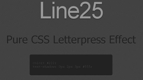
1. Create a Letterpress Effect with CSS Text-Shadow

letterpress-css-text-effects-typography
View Demo

2. Text Rotation with CSS

snook-rotation-css-text-effects-typography

3. Date Display Technique with Sprites

display-sprites-css-text-effects-typography

4. CSS Gradient Text Effect

gradient-css-text-effects-typography
View Demo

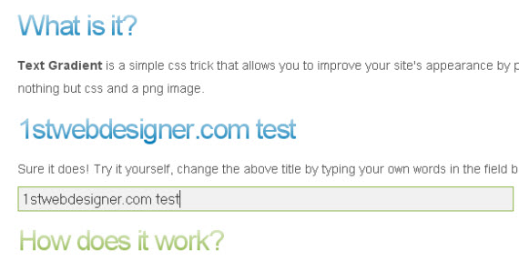
5. CSS Text Gradients

Yet another very similar tutorial about text gradients, but maybe you’ll like both variants trying to explain really how CSS text gradient effects work.
gradient-cssglobe-rotation-css-text-effects-typography

6. Add grunge effect to text using simple CSS

Article is based on the same technique as CSS text gradients using it to add grunge type effect to your typo!
grunge-css-text-effects-typography
View Demo

7. Two simple ways to create text embossing effect

embosing-two-tips-css-text-effects-typography

8. Text Embossing Technique With CSS

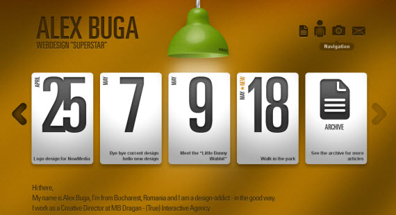
Example from AlexBuga homepage.
embossing-technique-css-text-effects-typography

9. Codename Rainbows

Beautiful CSS&Javascript code offered by DragonInteractive teaching how to get two-color gradient text effects, shadows and highlights.
rainbows-css-text-effects-typography
View Demo

10. CSS Drop Shadows

dropshadow-css-text-effects-typography

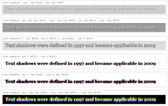
11. Text-Shadow Exposed

Make cool and clever text effects with css text-shadow. Very detailed article teaching you a lot of hidden tips how to achieve text glowing, embossing,shadowing with just few steps.
cool-clever-shadow-css-text-effects-typography

12. Background gradients and CSS

Pretty cool CSS background effect, which can be applied on hover giving a lot of options use it in creative way!
background-css-text-effects-typography

13. CSS Text-Shadow in Safari, Opera, Firefox and more

multiple-shadows-css-text-effects-typography

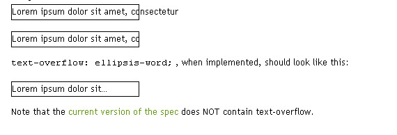
14. Text-overflow

overflow-css-text-effects-typography

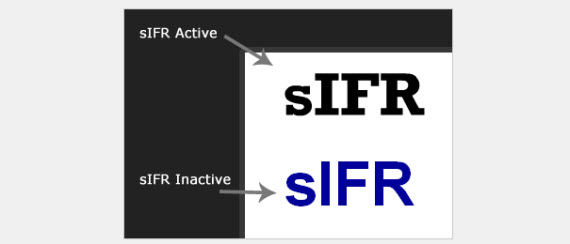
15. How To Implement sIFR3 Into Your Website

sifr-how-to-css-text-effects-typography

16. How To Use Any Font You Wish With FLIR

flir-css-text-effects-typography
View Demo

For Further Reading – More Typography Tips In Sucessful Web Designs

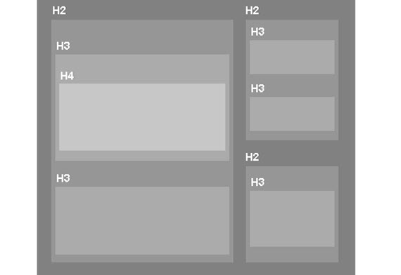
17. How to use headings in HTML

headings-how-to-css-text-effects-typography

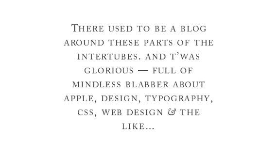
18. Advanced Typography techniques using CSS

advanced-typography-css-text-effects-typography

19. 10 Examples of Beautiful CSS Typography and how they did it…

Beautiful article explaining simple but very effective CSS tricks how to achieve beautiful typography effects with just a few lines of code.
10-typography-tips-css-text-effects-typography

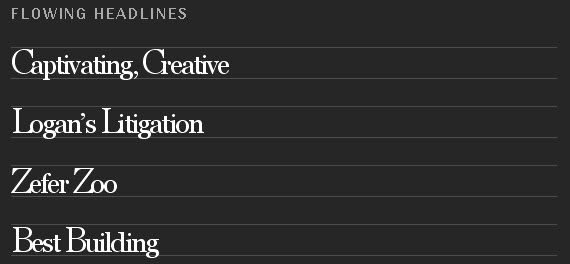
20. Typographic Contrast and Flow

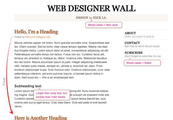
Nick La teaches how to apply right contrasts and flow in your webdesigns explaining why and what works and how to achieve that effect.
typographic-contrast-css-text-effects-typographyView Demo Overview

21. The Elements of Typographic Style applied in Webdesign

elements-typography-css-text-effects-typography

22. 5 Principles And Ideas Of Setting Type On The Web


Text Rotation with CSS

Once again, after reading somebody else's article, I felt inspired to put together an alternative example. In this case: Text Rotation.
Within the article I linked to, the example uses an image sprite and a sprinkle of CSS to get things positioned right. Well, maybe not so much a sprinkle. It's like the top fell off the pepper shaker and you've suddenly got a large pile of pepper on your food. It makes me want to sneeze.
Thankfully, many of the popular browsers of today support the ability to rotate HTML elements. Even better? We can make it work in Internet Explorer (back to version 5.5 even). How you might ask? Okay, let's look at the HTML.
31 July 2009
Nice and clean without too many extras. I conscientiously chose the date order I did to avoid having to use a comma. Otherwise, an extra span would be required to remove the comma from our final design.

The Magical CSS

For Webkit and Firefox (as of 3.5), you can take advantage of the proposed transform property to handle the rotation. Each browser requires its property prefix for now.
-webkit-transform: rotate(-90deg); 
-moz-transform: rotate(-90deg); 
In order to perform a transformation, the element has to be set to display:block. In this case, just add the declaration to the span that you want to rotate.
When it comes to effects in Internet Explorer, there is a surprising amount of power (and untapped at that, I'd say) in using filters. Although misleading, there is a filter called BasicImage that offers up the ability to rotate any element that has layout.
filter: progid:DXImageTransform.Microsoft.BasicImage(rotation=3);
The rotation property of the BasicImage filter can accept one of four values: 0, 1, 2, or 3 which will rotate the element 0, 90, 180 or 270 degress respectively.
The BasicImage filter has other properties that can be set such as mirroring, masking, greyscale and others. Alternatively, you can take advantage of the Matrix filter but the coordinates still don't make any sense to me.

In action


31 July 2009
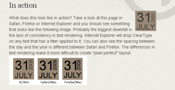
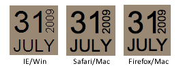
What does this look like in action? Take a look at this page in Safari, Firefox or Internet Explorer and you should see something that looks like the following image. Probably the biggest downfall is the lack of consistency in text rendering. Internet Explorer will drop ClearType on any text that has a filter applied to it. You can also see the spacing between the day and the year is different between Safari and Firefox. The differences in text rendering make it more difficult to create "pixel perfect" layout.

Here's hoping the article has offered up a little inspiration and shown that even IE has a few tricks up its sleeve, allowing us to pull off some layout fun.

Date Display Technique with Sprites


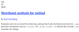
The typeface and the year being vertical should tip you off right away that images are being used to accomplish this. But also note that the date information is presented as text, as it should be, in the markup:


A quick peak in Firebug reveals the beautiful simplicity!

Sprites at Their Best

Hopefully it’s fairly obvious that each date doesn’t have it’s own unique graphic. The dates are pieced together from a single graphic (css sprites!), where different smaller parts of the graphic are shown in the three different regions: day, month, and year. Perhaps you’ll recognize this from a similar technique Joost de Valk posted about nearly a year ago.
Take a look at this beauty:

The HTML:

The end result HTML is going to be like this:


We have a wrapper, and three regions. This gives us what we need to match these schematics:

In a CMS like WordPress, the backend code to produce that would be like this:


The CSS

The CSS is where the sprite action really happens. With those special class names that we have set up in the HTML, we can set which portions of the image to use.
First, we set relative positioning on the parent. Then we absolutely position each of the three regions within. We set all three of them to use the same background image (our sprite), set their respective widths and heights, and kick the text off the page.
Then, we set each of the months (12 possibilities), days (31 possibilities), and years (goes 10 years out) with the specific background positioning needed to show the specific region we need.

.postdate {
  position: relative;
  width: 50px;
  height: 50px;
  float: left;
}
.month, .day, .year {
  position: absolute;
  text-indent: -1000em;
  background-image: url(/wp-content/themes/ljq/images/dates.png);
  background-repeat: no-repeat;
}
.month { top: 2px; left: 0; width: 32px; height: 24px;}
.day { top: 25px; left: 0; width: 32px; height: 25px;}
.year { bottom: 0; right: 0; width: 17px; height: 48px;}

.m-01 { background-position: 0 4px;}
.m-02 { background-position: 0 -28px;}
.m-03 { background-position: 0 -57px;}
... more like this ...

.d-01 { background-position: -50px 0;}
.d-02 { background-position: -50px -31px;}
.d-03 { background-position: -50px -62px;}
... more like this ...

.y-2006 { background-position: -150px 0;}
.y-2007 { background-position: -150px -50px;}
.y-2008 { background-position: -150px -100px;}
... more like this